
A reading I found particularly interesting this week was that of Simon Rogers’ article in the Guardian providing a 10 point guide to data journalism and how it’s changing. This article had some four points that were particularly interesting to me that I thought to relate to:
Rogers’ goes on to inform the reader that data journalism has been around ever since the existence of data, think about it… When ever we see articles review large companies the statistics informing the reader of its success, how much profit it comes into, percentage of increase etc. these statistics all come from data and help to reinforce the authenticity of the article providing factual data that draws the reader in. For example when a journalist chooses to include statistics:
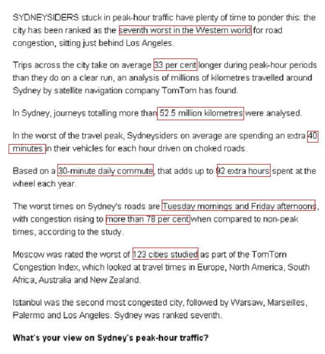
As you can see the journalist includes a great deal of data into the article to provide more depth. Ask yourself, if the research and data wasn’t included within the article, would it be interesting, intriguing or even newsworthy? In my opinion it wouldn’t have nearly half as much appeal to me without providing the data to back up the ideas made.
2. Open data means open data
Straight statistics will give you a thousand examples of journalists taking those numbers and running with them in completely the wrong direction, there have been plenty of occurrences where journalists manipulate the data and statistics that have been collected to portray a certain outlook. Although in saying this there is thankfully also decent data journalism taking place

For example it was later discovered the above article provided false information which was created by The Onion, leading to prove that the data that is sometime provided to the public may not always provided individuals with a complete unbiased or correct information.
3. Anyone can do it…
What is great about data journalism is that with the new technological advancements it enable anyone with the capability to publish anything, especially online in blogs, emails etc.
4. It’s (still) all about stories
Data journalism is not graphics and visualisations. It’s about telling the story in the best way possible, enabling the reader to feel a visual sense of what picture you’re trying to paint, or so to speak. Sometimes that will be a visualisation or a map, but not always it can also be presented in the form of a news story where the journalist creates such a descriptive account of what happen the reader can adequately enable a visual sense of what is trying to be said.
WORD: Transversality
Rogers, S. (2011) Data journalism at the Guardian: what is it and how do we do it?. [online] Available at: http://www.guardian.co.uk/news/datablog/2011/jul/28/data-journalism [Accessed: 23 April 2013].
Levy, M. (2013) Sydney traffic ranks high in world’s worst. [online] Available at: http://www.theleader.com.au/story/1464563/sydney-traffic-ranks-high-in-worlds-worst/?cs=12 [Accessed: 2 May 2013].